Laying out the sign-in options
Rounds. v2 (this one): three layouts for every sign-in option, after the owner asked to "look at alternate ways to lay out all of the options instead of just changing the font size". v1: one type size for the buttons (below, collapsed).
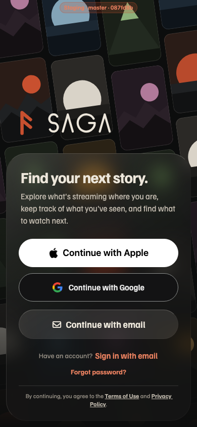
The first screen offers five ways in: Apple, Google, create an account with email, sign in with email, and reset a password. Each option arranges all five as the full first screen at 390 pt, side by side with today's screen and with 0, the type fix already built in draft PR #424 (today's layout, real iPhone screenshots). Every option uses the type scale from round 1's C: button labels 18 / 600 in 56 pt pills, links 16, Apple's label in the system font.
The first screen
At the largest text size
iPhone at the largest Dynamic Type size: controls grow to 1.4×, the headline to 1.5×, the line under it to 2× (MAX_FONT_SCALE). Each panel is drawn at its real width (366 pt), so a label that wraps here wraps on the phone. The screen scrolls when the panel is taller than about 640 pt (844 minus the status bar, the home indicator and the logo).
My recommendation
Ship 0 (PR #424) now, and take C if you want the layout to change too. 0 fixes what @sethw reported for the least risk: the native Apple button stays (no App Review question, unlike round 1's C), the three titles match at the default size and grow together at large sizes, and nothing that works today moves. The layouts answer a different question: whether five ways in should be arranged differently. Of those, C is the one I'd build. Every label says exactly what happens ("Sign in with email" never sits next to "Continue with email"), Apple stays first and as big as anything else, and "Forgot password?" shows only under Sign in. It reuses 0's Apple pill as is, so 0's work isn't thrown away. Returning people pay one tap on the switch, so the screen should remember the last tab on the device. B is the pick if you'd rather have one email path for everyone, but it needs a check for whether the email has an account.
Round 1 · one type size for the buttons (v1)
Beta feedback from @sethw on iOS: "The font sizes on the login buttons are all different. Normalize it to what looks best." The first sign-in screen has five pieces of tappable text in four sizes and two typefaces, and on iPhone Apple's button draws its own, larger title.
Today
Staging web at 390 px, signed out. The sizes come from the code.
| Piece | Web | iPhone | Height |
|---|---|---|---|
| Continue with Apple | System font 18 / 600 | Apple's native button: SF, about 24 pt (the system sizes the title from the height, about 43%) | 56 |
| Continue with Google | Familjen 16 / 600 | Familjen 16 / 600 | 56 |
| Continue with email | Familjen 18 / 600 (Button size="lg") | Familjen 18 / 600 | 58 |
| Have an account? · Sign in with email | 14 / 400 · 16 / 600 link | 14 / 400 · 16 / 600 link | – |
| Forgot password? | Familjen 14 / 600 link | Familjen 14 / 600 link | – |
- iPhone is worse than web. The native Apple button (
AppleSignInButton.ios.tsx, 56 pt tall) sets its title from its height, so it comes out about 24 pt next to Google's 16. Only the height, corner radius and style can be changed. - Google is smaller than email (
GoogleSignInButton.tsx:38usestext-base;Button size="lg"usestext-lg), and the email button is 2 pt taller because it sizes from padding while the others are fixed ath-14. - The links use two sizes (16 and 14), and the line before the first link is 14.
- At larger text sizes they drift further apart: our labels grow up to 1.4×, but the native Apple title never grows.
The first screen
Every option uses the same links: "Have an account? Sign in with email" and "Forgot password?" both at 16, so the screen has one button size and one link size.
At the largest text size
iPhone at the largest Dynamic Type size, where controls stop growing at 1.4× (MAX_FONT_SCALE.control). Web ignores this setting. Apple's native title never grows.
Round 1 recommendation
C, one Apple button everywhere. It keeps the 56 pt pills that were approved, puts every label at the large button's 18 / 600, and it's the only option where the three buttons stay matched at every text size, because the native button's title can't grow with Dynamic Type. iPhone and web also end up identical, since web already uses this button. The risk is the swap from Apple's native button to a custom one: Apple's guidelines allow a custom button that uses their logo and the system font, but it needs a device check and a TestFlight build before it ships. If you'd rather keep the native button, pick B.