Where Filters go when the bar shrinks
tick() on every tap like Swipe, drawn glass on web and Android.Today on iPhone
The real app: ios/review at 25717998 (the pocket capsule and the 460 ms fold), iPhone 17 Pro simulator, staging, the smoke account.
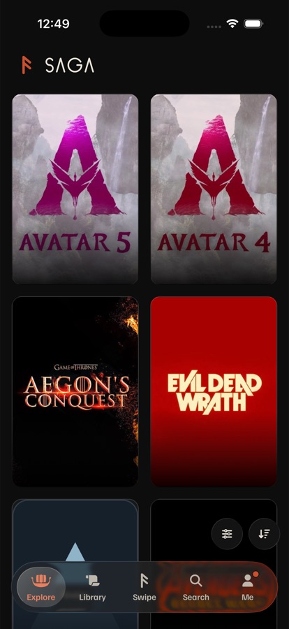




- Where they are:
FilterBar at="bottom": 44 pt round glass buttons, 8 pt apart, 12 pt from the right edge, about 10 pt above the bar. Filters turns ember with a count when filters are on (saved services don't count). - Explore and Library: the row fades out in 220 ms while you scroll and comes back 180 ms after you stop (
useScrollRest). When the bar collapses (340 msCHISEL), the row slides 24 pt down with it (RidesTheBar). So on a long page the row comes back at the right edge, over a capsule that has moved to the middle. - Swipe: the first swipe folds everything in 460 ms
FOLD(bezier .4, 0, .2, 1): the moon, Filters and Sort slide right into the card's ⋯, each 12% of the move after the last (FoldingSlot), and the card grows into the room the bar gives back. - Feel:
tick()on each button. No haptic on the fold or the collapse.
What all three share
Rest stays as it is
- At rest nothing moves: Filters and Sort stay in thumb reach over the full bar (owner, 2026-10-07 and 10-08). Each option only changes what happens once the bar collapses.
- The bar's rules are unchanged: it collapses after 12 pt down once 48 pt in, and expands on 24 pt up, at the top, on a tap on the bar, or on a tab change.
- Filters on looks the same everywhere: ember, with Filters' own count badge.
Motion and feel
- Lists: the bar's 340 ms
CHISEL. Swipe: 460 msFOLD, card and bar together. The row's fade is 220 ms; tab names go in 180 ms and come back after 55% of the move. - Haptics:
tick()on every tap; nothing on motion you didn't ask for. - Reduce Motion: places and sizes jump, with a 120 ms cross-fade. Reduce Transparency: solid granite.
Access and platforms
- VoiceOver: the bar never collapses while it runs (
tabBarCanCompact), so A and C keep today's two buttons there. B's dock follows the scroll, so it docks with VoiceOver on too. - Web, 768 px and wider: the bar never collapses, so A and C look like today; B docks at every width.
- Android and web phones: drawn glass, a ripple on Android, hover on web.
1 · Try it
Scroll Explore or Library down until the bar shrinks, then scroll back up. On Swipe, drag or tap the card to fold, and tap the card's ⋯ to open the row again. Tap Filters, Sort or the moon to open their sheets. The chip at the top right shows the haptic the phone would play.
2 · Every state, side by side
The same moment in each option, at the same size, in the material chosen above.
How they compare
| Option | Scrolled, filters on | Reach while scrolled | To Filters / Sort, scrolled | Swipe | VoiceOver | Web and Android | Ships and cost |
|---|---|---|---|---|---|---|---|
| A · Joins the bar | Ember circle with its count, beside the capsule | Bottom, in thumb reach | 1 tap / 2 taps (tap the bar, then Sort) | Fold sends the moon and Sort into the same circle; the card's ⋯ still opens the whole row | Today's two buttons (bar stays expanded) | Two drawn glass pieces side by side on phones; wide web unchanged | Over the air About 1–2 days: a trailing slot in AppTabBar that FilterBar fills while its screen is focused |
| B · Docks at the top | The filters in words, ember, at the top | Top, out of thumb reach | 1 tap / 1 tap | Unchanged (the card takes the logo's slot) | Docks too; first after the status bar | Docks at every width | Over the air About 2 days: a top dock on the section strip's pattern, plus a words summary; an exception to the no-chips rule |
| C · Steps aside | A count in the corner of the selected tab | Hidden; one flick up brings it back | 2 moves / 2 moves | Today's fold, plus the count on Swipe's tab | Today's two buttons (bar stays expanded) | Same rule on phones; wide web unchanged | Over the air About half a day: the row follows the bar instead of the scroll; a count on the lens |
My recommendation
A, Filters joins the bar. It fixes what the owner saw: on a long page, Filters stops floating at the right edge and sits on the capsule's own line, at its height, as one centered group. That's the iOS 26 shape of a tab bar with one round button beside it. Filters stays one tap away at any depth, and when filters are on the circle stays ember with its count, so a filtered grid always says so. Swipe folds into the same circle, so the three tabs finally match when collapsed. It ships over the air and needs no new component: FilterBar's FoldingSlot does the fold and Glass draws the circle.
What it costs: Sort takes two taps while the bar is collapsed (Sort is used far less than Filters). On Swipe, the circle and the card's ⋯ both lead to Filters. Before it goes to the phone, measure the native glass group's merge in a Release build (docs/performance.md); if it drops frames, draw the circle as its own glass beside the capsule instead of merging.
Not B: it's the only option that names the filters in words, but it moves the controls out of thumb reach and back to the top, which the owner reversed on 2026-10-07, and it breaks the no-chips rule. Not C as the main answer: it's the cheapest and the calmest, but Filters takes two moves on a long page and a count on a tab is easy to miss or read as a notification. If A's glass group costs frames, ship C first.