A tab bar that shrinks, never hides
ios/search-tab, on PR #433's native Liquid Glass bar). Built to fit the Liquid Glass Sprint Review (#442): native glass on floating chrome only, round glass buttons, Swipe-quality feedback, one material at the bottom of the screen, good web and Android versions, no new one-off components.Today on iPhone
The real app: branch ios/search-style (f22508b1), iPhone 17 simulator on iOS 26, staging. These still show Friends; the Search tab takes its place.
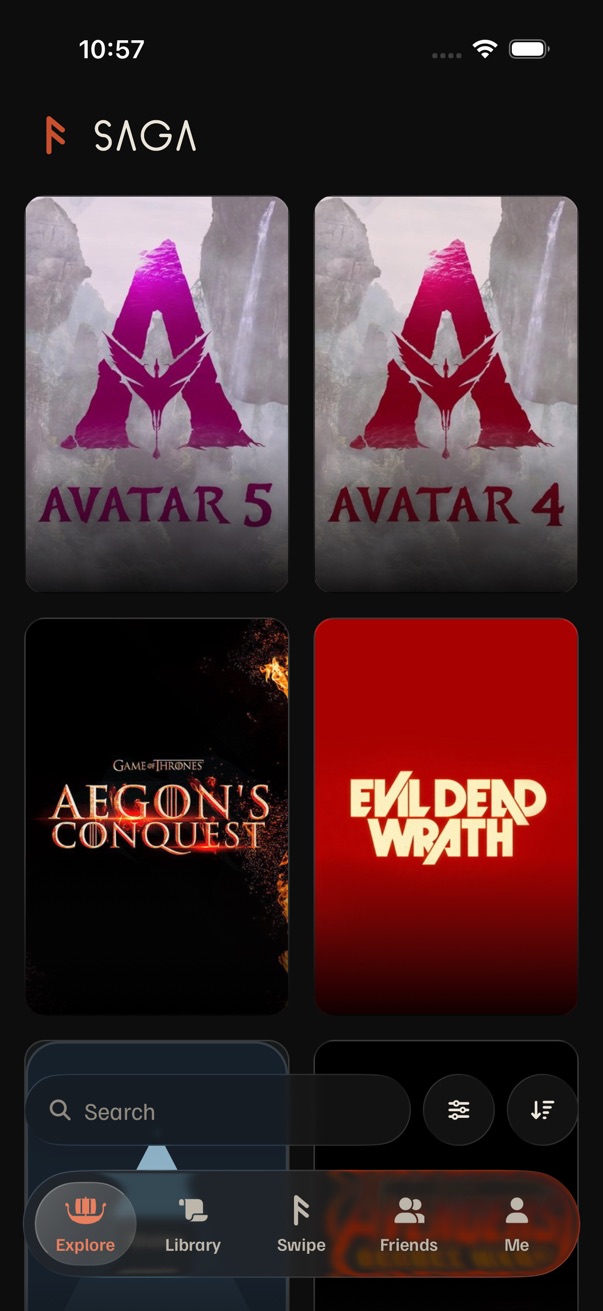
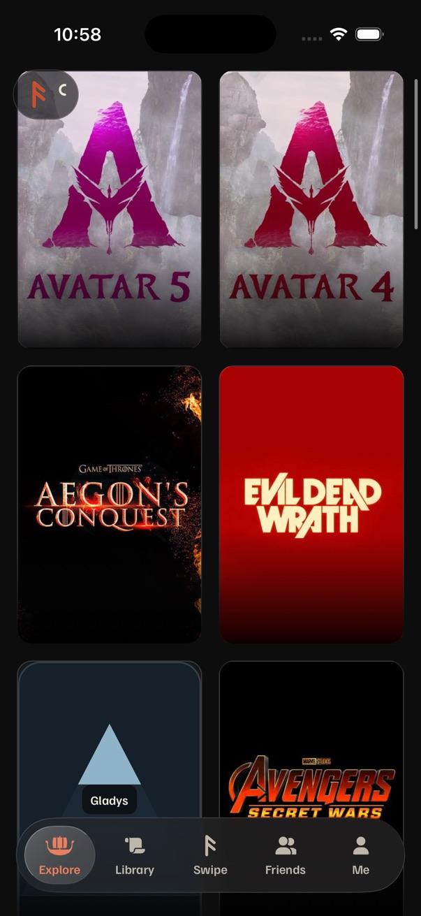

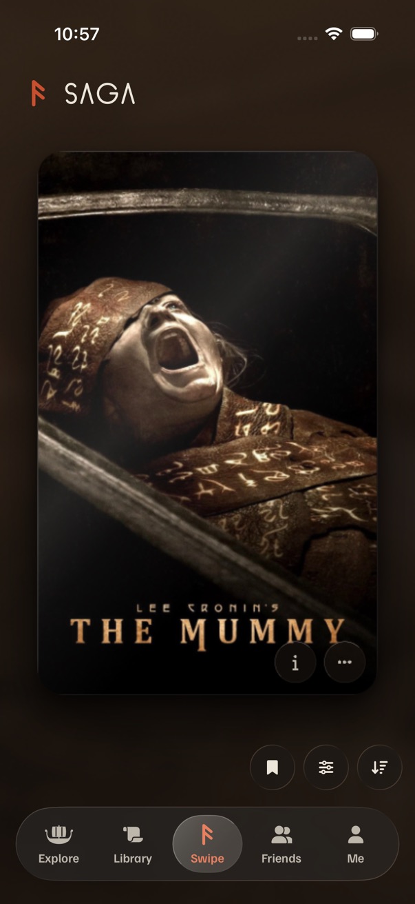
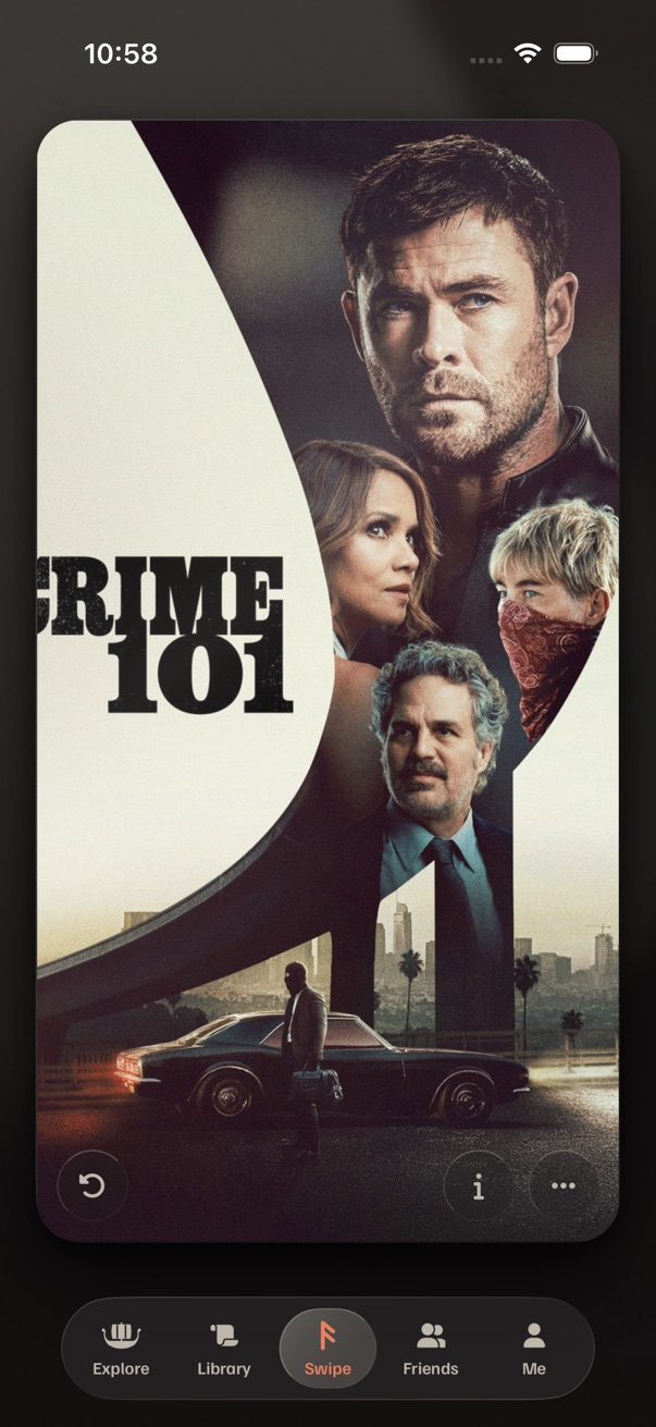
- The bar: 370 × 69 pt, 22 pt above the screen's bottom edge; five 72 pt tabs, each a 24 pt icon over a 12 pt label (held to a fixed size by
FixedType); a lens 2 pt inside the selected tab that glides inDURATION.slow280 ms withCHISEL. NativeGlassView(regular) on iOS 26, drawnGlasselsewhere (TabBar.tsx). - Swipe's fold (
swipe.tsx:252): the first swipe setstabBarCompact0 → 1 over 280 msCHISEL, and the bar scales to 0.88 and drops 10 pt (tab-bar-compact.ts). It stays folded until you open it or come back to the tab. Labels stay. - Scrolling elsewhere: the bar never changes. Only the search row hides, coming back 180 ms after scrolling stops (
useScrollRest). The logo collapses over 72 pt and steps aside after 160 pt (ScrollLogo: 12 pt down to hide, 24 pt up to return). - Feel:
tick()on every tab tap; tapping the current tab goes to the top. No haptic on the fold.
What all three share
When it collapses and expands
- Collapses after 12 pt of scrolling down, once the list is 48 pt down (the logo's own intent distance).
- Expands on 24 pt of scrolling up (the logo's reveal), at the top (8 pt or less), on a tap on the bar, on a tab change, and on a pushed screen: every screen starts expanded.
- Swipe: collapses with the fold on the first swipe and opens with it, as today.
Motion and feel
- One value,
tabBarCompact: Swipe's fold drives it today; the scroll worklet (useScrollChrome) becomes its second driver, on the UI thread, with no React render per scroll. - 280 ms
CHISELfor the size and the lens. Labels fade in 120 ms: before the shrink, and after the growth. - Haptics: none when scrolling changes the size (it's ambient, like the logo);
tick()on every tap in the bar, collapsed or not. - Reduce Motion: the two sizes swap with a 120 ms cross-fade; nothing slides or scales.
Access and platforms
- VoiceOver: each tab keeps its name in both sizes ("Explore, tab, 1 of 5"). While VoiceOver runs, the bar stays expanded, so focus never chases a moving target.
- Text size, up to AX5: labels stay in
FixedType(at most 1.2×), so tabs keep their width; collapsed shows no text. - Web: drawn glass, the same rule at phone widths; 768 px and wider stays expanded, and tabs brighten on hover. Android: drawn glass (after the
blurMethodfix, review A6), a ripple on press. Reduce Transparency: solid granite. - The search row above the bar keeps today's rule and rides down with the bar, 12 pt above it.
1 · Try it: scroll, tap, swipe
Scroll a list down and the bar shrinks; scroll up, reach the top, or tap the bar and it grows back. Tap any tab, collapsed or not. On Swipe, drag the card or tap it to swipe. The chip at the top right shows the haptic the phone would play.
2 · Every state, at 1:1
The bottom of the screen at iPhone size over Explore's posters, in the material chosen above.
Cost at a glance
| Option | Ships | What changes in code | Performance | Drops |
|---|---|---|---|---|
| A · Pocket capsule | Over the air | AppTabBar: tab width, label height and lens follow tabBarCompact; Swipe's deck room re-tuned to the new height; the scroll driver in useScrollChrome. | The glass resizes for 280 ms. Measure a Release build (docs/performance.md); if it costs frames, size the glass once and animate a mask. | Swipe's 0.88 scale fold (it becomes this capsule); labels while collapsed. |
| B · Same bar, slimmer | Over the air | Today's transform on every tab, plus label opacity and height. | Cheapest: a transform and one small height. | Size: icons shrink to 21 pt and the bar is 35 pt tall inside, so taps need hitSlop to stay 44 pt. |
| C · Search on its own | Over the air | A's capsule with four tabs, plus a round glass Search beside it in a GlassContainer; tab order, tests and the web shortcut change. | Two native glass views instead of one. | Swipe at the center; one bar. Explore and Library get two searches stacked at the bottom. |
Not offered: expo-router's NativeTabs (iOS 26's own tab bar, minimizeBehavior="onScrollDown"). It shrinks for free, but to the current tab and Search only, and it drops the carved rune, the lens, the badges, the Library pulse and the journey. It would also mean rewriting navigation.
My recommendation
A, the pocket capsule. It matches what the owner described: glass icons in a compact capsule with the lighter pill behind the selected one, words when expanded and icons only when collapsed. All five tabs stay one tap away while collapsed. It keeps the one bar, the one lens and the one motion value, and Swipe's fold becomes the same collapsed capsule, so the bar looks the same on every tab instead of having a Swipe-only size. It ships over the air. Before it goes to the phone, measure the 280 ms resize in a Release build.
Fits the sprint review: native glass only on the floating bar, one material at the bottom of the screen (bar, search row, round buttons), tick() and the press dip on every tab like Swipe's controls, drawn glass with hover on web and a ripple on Android, and no new component (it's AppTabBar and Lens).
Not B: it's the safest change but not the look the owner asked for, and the collapsed icons get smaller than the 44 pt rule wants. Not C yet: it's the iOS 26 shape, but on Explore and Library it stacks two searches in the thumb zone, and it moves Swipe off the center. If the search row on Explore and Library ever folds into the Search tab, try C again.