Person page sections
Today
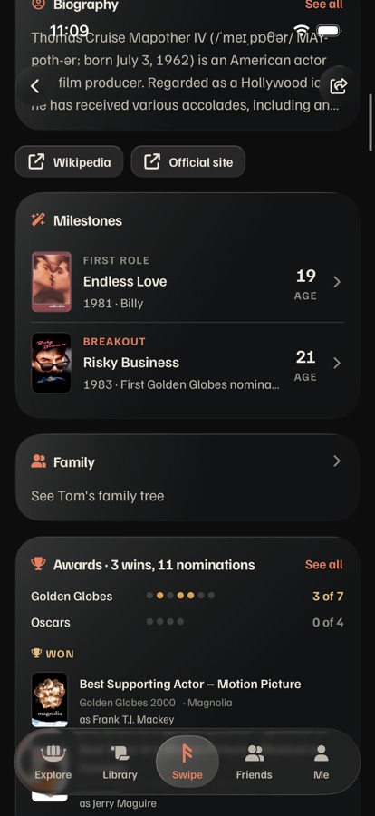
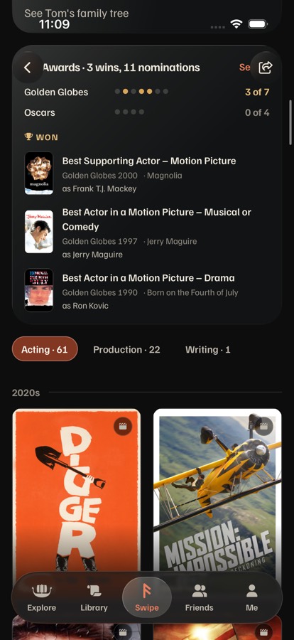
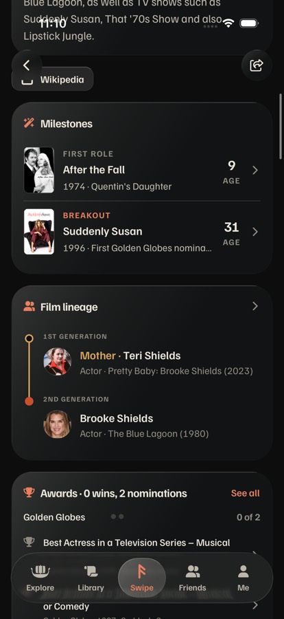
iPhone 17 simulator, iOS 26.5, branch ios/review at 2a9712ee, against staging. Tom Cruise is a rich page: biography, both links, Milestones, Family, 3 Golden Globes from 11 nominations, then 84 credits across three departments, by decade.


The links look like the page's own buttons
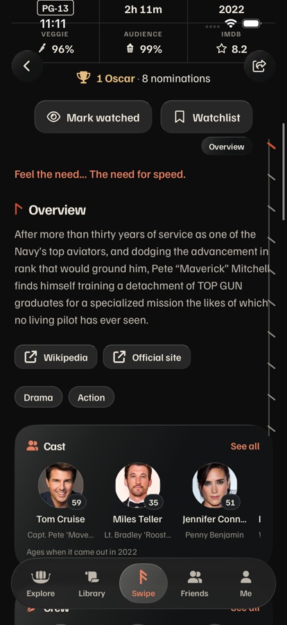
ExternalLinks.tsx:39–48 draws Button variant="secondary" size="sm", the shape of Mark watched, Watchlist and the department buttons. The small external icon is the only difference, and it sits where a contents row would. It's the same on title pages (movie/[id]/index.tsx:111), studios and places.The rail can't simply be turned on here
Page.tsx:106: railEnabled = rail && scroll. The person page is scroll={false} with everything in PosterGrid's header (a FlashList, person/[id]/index.tsx:76–96). Every option below needs Page.RailSection to work in a list header, and a way to scroll the list to it.Where you'd want to go
About two and a half screens of story (Biography, Milestones, Family or the lineage ladder, Awards), then the long part: credits by decade. Skipping the story to reach the credits, or finding the 1990s, takes several flicks today. The logo retracts once you scroll, leaving the middle of the top row empty.1 · Jumping between sections
Sections: Biography, Milestones, Family (the lineage ladder when there is one), Awards, Credits. Each shows only when the person has it. All three use the links in their recommended place (row 2, A), so this row compares only the jump.
2 · Where Wikipedia and Official site go
They should read as leaving Saga, never as a place on the page. Tap a link to see it open in the in-app browser (Safari's sheet on iOS, a new tab on web).
Side by side: behavior, access, platforms, cost
| A · Stave rail | B · Section strip (recommended) | C · Sections menu | |
|---|---|---|---|
| The jump | Tap a tick: the page scrolls with iOS's own animation (about 0.3 s, whatever the distance) and stops with the section's title under the top row. The label shows for 1.2 s. | Tap a name: the lens slides to it at once (280 ms, chisel) and the page scrolls (about 0.3 s). The lens stays on the tapped name while the page passes the others. | Tap the pill, the menu grows from it (280 ms, chisel); tap a row, it closes (120 ms) and the page scrolls (about 0.3 s). Decades are rows too. |
| Where you are | The lit tick; its name only while moving. | The lens, always visible once docked; the strip scrolls sideways to keep it in view. | The pill's words ("Awards", "Credits · 2010s"); the menu ticks the current row. |
| Haptics | tick() on a tap, as the title page's rail. | tick() on a tap, as the tab bar and the rail. None while scrolling past sections. | tick() on opening and on a pick. |
| VoiceOver | "Page sections" toolbar, "Jump to Awards, button"; tiny targets, hard to find by touch. | One "Sections" tab bar: "Awards, tab, 4 of 5, selected". Swipe through it in order; double-tap jumps. | "Sections, Awards, button"; the menu reads as a list, focus moves into it and back to the pill after a pick. |
| Everywhere | Each section's card title is announced as a heading, so the rotor's Headings jumps section to section in every option. After a jump, VoiceOver focus moves to that section's title. | ||
| AX5 text | The label grows; the ticks don't. | Names stay at a fixed scale in the docked capsule (as Library's shelves); the in-page strip grows and scrolls sideways. | Menu rows grow and the menu scrolls; the pill shows only the section's name. |
| Web | Drawn glass label; ticks get a hover. Keyboard: Tab through the ticks. | Drawn glass capsule with a hover brighten; Tab to it, arrow keys move between names, Enter jumps. At 1280 it docks over the page's column. | Drawn glass menu; Esc closes; arrow keys move. |
| Android | Drawn glass label, ripple on a tick. | Drawn glass capsule, ripple; the system back doesn't touch it. | Drawn glass menu; back closes it. |
| What it costs | Over the air Teach Page.RailSection list headers. Smallest: the rail exists. | Over the air The same, plus Page drawing its sections as SegmentedControl floating in the logo's row when asked (rail="strip"). Native glass is already in Glass liquid. | Over the air The same, plus a new floating menu (no native menu module in the build; @expo/ui would mean a new binary). |
| What it drops | Nothing new to learn, but nothing to see at rest either; the owner's instinct (tap a row of names) isn't met. | The logo's empty slot once scrolled. A second look for jumping, unless title pages move to it too. | Two taps per jump; a floating pill next to the tab bar on every scroll. |
Fits the sprint review
Canonical pieces
B is Library's shelves moved to this page:SegmentedControl with floating in the logo's row, its sliding Lens, sections registered by Page.RailSection exactly like the rail. No new control. The links reuse Card (A's footer) or ListRow (B's rows).Native glass only on chrome
The docked capsule floats over the page, so it's native glass (Glass liquid="regular", materializing with animate, never a fade). The strip resting in the page is content on basalt, so it's drawn glass. The links are text, never glass.Feedback like Swipe
Every tap answers in the same frame: the lens moves before the page does,tick() fires, and the page lands with the section's title under the top row, never under the chrome. Reduce Motion: the lens and the page jump.Web and Android
Drawn glass with a hover and full keyboard on web; ripple and drawn glass on Android (its blur needs the review's A6blurMethod fix). Pairs with the review's P3: the top scroll-edge fade sits behind the docked capsule.My recommendation
Jump: B, the section strip. It turns your instinct into the real thing: right under the header there's a row of names, and tapping one goes there. Once you scroll, the same control docks into the logo's empty slot as native glass, so where you are and where you can go is always one tap away. It's Library's shelves, not a new control, and it ships over the air.
Links: A, in the biography's footer. Wikipedia and the site's own address with the ↗ sit under the text they extend, in link color, with no button shape, so they read as "read more elsewhere." Do the same under a title's overview (one ExternalLinks change). With no biography, the same line sits under the header's facts.
Which one: A, B or C for each row, a mix, or another round? Title pages could move from the rail to the strip later with one prop; that's a separate call.