Saga · Sprint review · Round 2 · October 9, 2026 · Apple sprint (#373) · tracked on #442
Saga Liquid Glass Sprint Review
Round 2 (this page): the audit. The owner asked for a consistency review starting with people profiles and everything connected to them, then the whole app: the same job done different ways, the same thing looking different, every interaction critiqued, every duplicated component tracked, and a scorecard per platform, so the iPhone app gets as good as Swipe and Library while web and Android stay really nice. Audit only: no prototypes and no app code.
Round 1 (the Liquid Glass ranked list with its red Recommended boxes) is kept unchanged at the bottom: Liquid Glass, round 1.
Evidence. iPhone 17 simulator (iOS 26.5), branch ios/review at a49e03ed, against staging, the smoke account. Web through Playwright at 390 and 1280 px against staging. Android from the code only: no emulator was run, so every Android line is unverified. Crops are real screenshots; the gear at the top right of some is the dev build's Tools button.
Where it stands
Swipe, Library and Explore hold the bar. The people area (Me, someone's profile, Connections, Friends, Inbox) is where the app comes apart: all eight square icon buttons in the app live there, Share has five buttons with four names, and three different people strips sit on one profile.
The two biggest gaps
Saving a title off Swipe feels like nothing. The title page's Watchlist only changes color: no haptic, no Library pulse, and it calls it "Watchlist / In watchlist / Mark watched" where Swipe and Library say Add, Seen and Passed. Chrome sits on text: Back, Share and Me's buttons float over scrolled content with no scroll edge on every pushed screen.
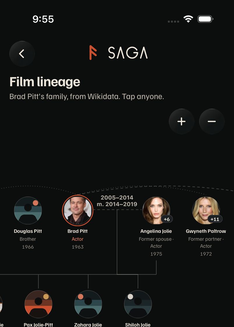
Film lineage for Brad Pitt
Not a bug on today's build. The tree draws on iOS (deep link and Person → Family, ios/review a49e03ed) and on web at 390 and 1280; staging returns 180 relatives and 265 links. Round 1's blank frame was on ios/search-style 8bce35a7 and didn't reproduce. Screenshot.
1 · Consistency findings
Each finding: what differs, where (file:line on ios/review), severity, platforms, the pattern that's right today, and a one-line direction. People profiles and everything connected first, then the rest of the app.
People profiles and everything connected
P1Share a profile: five buttons, four names, three places
HighiOSWebAndroid
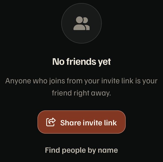
Your profile has a labeled Share button in the header row. Someone else's has a square icon beside Follow. Friends has a round top-right button named "Share invite link", and its empty state a big "Share invite link". Connections' empty state says "Share your profile". All five open the same sheet. Titles and people use a round top-right Share that goes straight to the system share sheet, and studios, places, awards and seasons have no Share at all.
Where
ProfileView.tsx:79–87 (Me), :107–115 (theirs), (tabs)/friends.tsx:59–66, FriendsHome.tsx:118, ShareProfileButton.tsx:7 via ConnectionsScreen.tsx:173; titles SharePageButton.tsx:38 on movie, show and person only
Right today
No rule. The closest pattern is the title page's round Page.TopButton Share.
Direction
One Share: the round top-right button on every page with a public link, profiles included, always labeled "Share" (VoiceOver says whose).
Me: a labeled Share in the header row.Someone's profile: a square icon.A person: round, top right, over the biography.
P2Every square icon button in the app is in the people area
HighiOSWebAndroid
Button's icon sizes are rounded squares unless a caller passes rounded. Swipe, the filter bar, the card and media buttons pass it; the eight that don't are Share, ⋯ and the bell on profiles, the ⋯ on Connections and Friends rows, Inbox's row button and a picker. Next to the round Back and round top buttons, they read as a different app.
Where
Square: ProfileView.tsx:92, 110, 118, ConnectionsScreen.tsx:344, 416, FriendsHome.tsx:234, InboxScreen.tsx:239, pickers.tsx:59. Round: swipe.tsx:619, FilterBar.tsx:305, SwipeCard.tsx:565, MediaButton.tsx:27 and 3 more. Sizes: Button.tsx:56–57
Right today
Round (RoundButton, Page.TopButton, every icon button outside people).
Direction
Icon sizes are round by default in Button; delete the rounded prop for them.
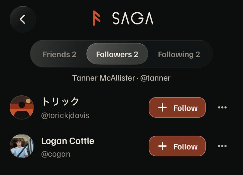
Connections: Follow, then a ⋯ per row. Segment counts sit in the tab names.
P3Back, Share and Me's buttons sit on top of scrolled text
HighiOSWebAndroid
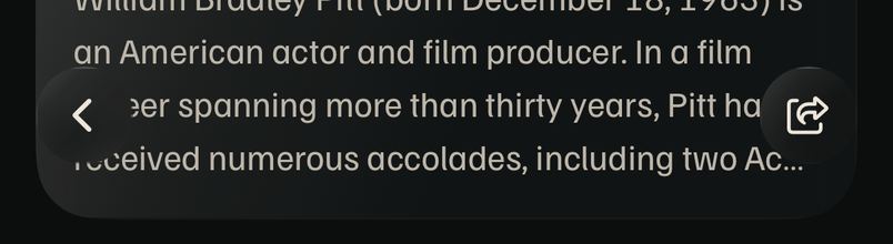
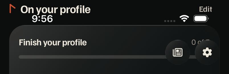
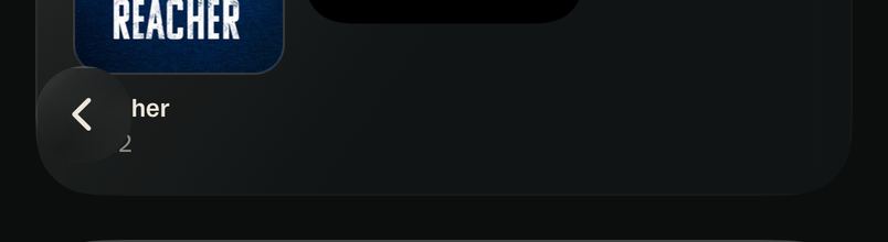
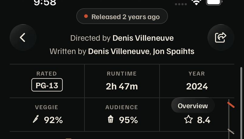
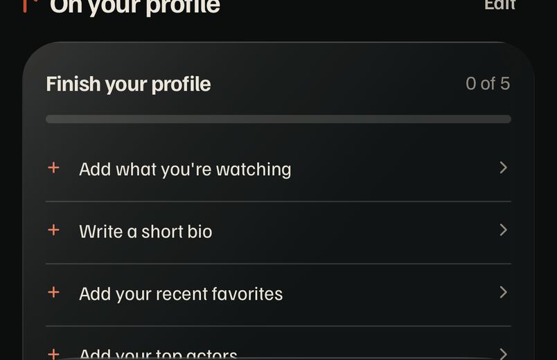
No pushed screen has a scroll edge. Scrolled, Back lands on card titles ("her" on someone's profile), Me's What's new and Settings cover the checklist's "0 of 5", the status bar's clock sits on "On your profile", and on a title page Back and Share cover the credit line. Brand identity § 6 asks for "a soft scroll-edge fade, not a solid header"; iOS 26 draws exactly that under its own toolbars.
Where
Page.tsx:166 (BackButton) and :240 (RoundButton) float with nothing behind; every screen with showBack or topAction
Right today
Nothing. The bottom bar has its glass; the top has none.
Direction
One top scroll-edge fade in Page (status bar plus the round-button row), on every platform, shown once content passes under it. Pairs with round 1's row 1.
Me, scrolled.Someone's profile, scrolled.Dune: Part Two: Back and Share on the credits; the rail's "Overview" label over the IMDb score.
P4Three people strips on one profile
MediumiOSWebAndroid
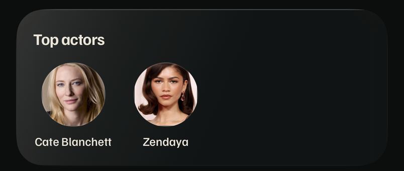
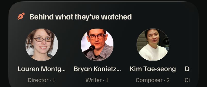
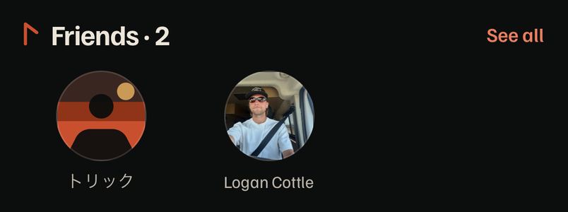
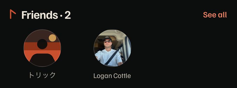
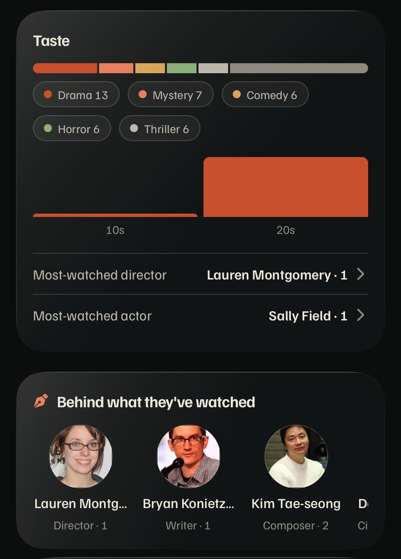
Top actors draws Avatars with a name. "Behind what they've watched" draws CastMember with a name and a role line. Friends draws bigger Avatars with a smaller name. Three photo sizes, three caption styles, two of them scroll and one doesn't, on one scroll.
CastMember (design.md: a person in a row on title pages and the card back).
Direction
One people rail at CastMember's size for actors, crew and friends; the line under the name is the only thing that changes.
P5See all in two places on one profile
MediumiOSWebAndroid
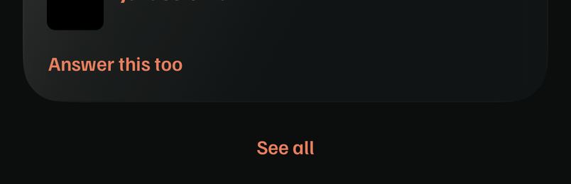
Answers end in a centered See all at the foot that expands in place; a few cards down, Friends has See all in its header that opens a page. ui-patterns allows a disclosure for answers but never says where it goes, and "See all goes in the header, never at the foot" is the rule people learn everywhere else. The person page's biography already puts its disclosure in the header.
Where
ProfileAnswers.tsx:82 vs FriendsStrip.tsx:42; the header disclosure: person/[id]/index.tsx:224
Right today
See all in the card's header (Card seeAll, the biography's DisclosureToggle).
Direction
A disclosure also goes in the header; add that to ui-patterns § Disclosures.
Answers: at the foot.Friends: in the header.
P6Profile cards drop the icon every other card has
MediumiOSWebAndroid
About 48 of the app's 69 Cards carry an icon by their title: every title-page, person and Settings card. On a profile, Taste, Awards, Time watched, Answers, the lists and Finish your profile have none, but "Behind what they've watched" has one, so the one with an icon looks like a different kind of thing.
A titled card has an icon (title pages, person pages, Settings, Edit profile).
Direction
Make icon required whenever Card has a title.
Time watched and Taste without, Behind what they've watched with.
P7Rows built by hand: three chevron sizes, the wrong press
MediumiOSWebAndroid
ListRow is used 14 times; at least 13 rows that open something are built by hand around it. Their chevrons are xs or sm, muted or ochre, and most press with feedback="quiet" (the text dims) where design.md says a row's glass brightens. The profile's checklist and the person page's Milestones sit one tap apart and look like two systems.
Where
ProfileView.tsx:326, ProfileNumbers.tsx:163, 359, 412, ProfileInterestsSection.tsx:106, 170, Milestones.tsx:60, NowWatching.tsx:36, TitleExtras.tsx:192, AwardsSection.tsx:188 (rounded-lg, off the radius tokens), category/[key].tsx:93, RankedRow.tsx:87, AdminHome.tsx:39
Give ListRow a leading poster and a trailing value, then move every hand row onto it; lint a chevron Icon outside it.
Me: xs chevrons, quiet press.Person: sm chevrons.
P8Sheets end four different ways
MediumiOSWebAndroid
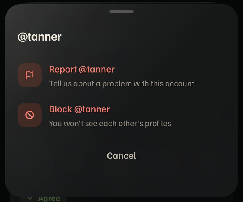
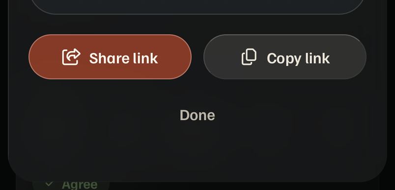
The ⋯ sheet ends in a ghost Cancel. The share sheet ends in a ghost Done under two pill buttons. After blocking, Done is a solid ochre button; after reporting, Done is ghost beside a red Block. Filters end in Apply, and most sheets have no button (pull down, tap outside). The share sheet's buttons are pills where every other text button in the app has 16 pt corners.
Where
ProfileActionsSheet.tsx:114, 162, 186, ShareProfileSheet.tsx:88, 101, 114, BuilderSheet.tsx:199; pills also on PublicProfileView.tsx:68
Right today
design.md § Filters: "Apply always closes"; nothing for other sheets.
Direction
A sheet of choices ends with no button (pull, tap outside, Esc, Android back); a task sheet ends with its one action. Never Cancel and Done side by side.
⋯: Cancel.Share: pills, then Done.
P9One action, two names; one place, two names
MediumiOSWebAndroid
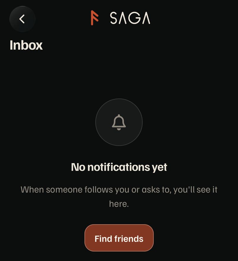
The people search is "Find friends" on Inbox and Connections and "Find people by name" on Friends. The bell is Inbox, its page is titled Inbox, and its empty state says "No notifications yet". After blocking: "You won't see each other's profiles any more" (British; American is "anymore").
ui-patterns § Words on actions; brand § Voice (American English).
Direction
"Find people" everywhere; "Nothing in your inbox yet"; "anymore".
Friends: Share invite link, Find people by name.Inbox: No notifications yet, Find friends.
P10Empty cards and empty states pick their own buttons
LowiOSWebAndroid
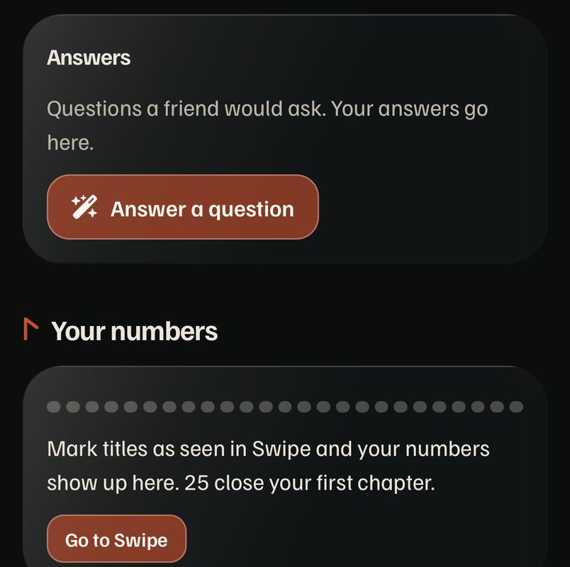
On Me, the empty Answers card has a medium ochre "Answer a question" and the empty Your numbers card a small ochre "Go to Swipe", one scroll apart. Empty states use solid (Find friends, Go to Swipe), secondary (Share your profile, Filters) or solid plus a ghost second (Friends).
EmptyState draws its buttons itself: one primary and an optional ghost second; callers pass words and handlers.
P11Banners, pills and progress bars drawn by hand on profiles
LowiOSWebAndroid
The "You and @astrid are friends now" notice and the "Couldn't refresh" line are hand-built boxes, not Alert. "Mostly movies" is a hand pill, not Badge. Taste's genre chips are hand pills. There is no progress bar primitive, so four are drawn by hand at three heights.
P12Signed out, the same profile is laid out differently
LowWebiOS (links)
A shared profile opened signed out shows "About me" as its own titled card and Now watching on its own. Signed in, both sit in one untitled card under "On their profile". The person someone shares should look the same before and after they join.
Where
PublicProfileView.tsx:107–114 vs ProfileView.tsx:243–290
Right today
The signed-in ProfileGroup.
Direction
PublicProfileView renders ProfileGroup.
The rest of the app
A1The two core verbs change name and color by screen
HighiOSWebAndroid
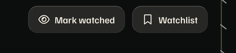
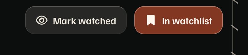
Swipe stamps Seen, Pass and Add. Library's shelves are Watchlist, Seen and Passed. The title page says Mark watched → Watched (green) and Watchlist → In watchlist (ochre). Me says "Mark titles as seen". A person learns "Seen" on Swipe and then has to find "Mark watched".
Swipe and Library (the owner's reference screens): Seen and Watchlist.
Direction
Title page buttons read Seen and Watchlist, on and off with a check, in Swipe's lichen and the watchlist color.
Before a tap.After: In watchlist, ochre. No haptic, and Library's tab doesn't pulse.Library: Watchlist, then Seen and Passed as icons.
A2The same fact twice on a title page, and two vocabularies for streaming
MediumiOSWebAndroid
A movie's release appears in Facts ("Oct 22, 2021 in theaters") and again in Details ("Released Sep 15, 2021"), two different dates on one page, plus the header badge. Where to watch says Stream / Rent / Buy; the back of the swipe card says Stream on / Rent or buy for the same data.
Where
TitleExtras.tsx:244, 312 and movie/[id]/index.tsx:245; WatchProviders.tsx:11, 25 vs CardBack.tsx:171
Right today
ui-patterns § Section order (Facts holds the release).
Direction
Release once, in Facts; title page labels "Stream on" and "Rent or buy".
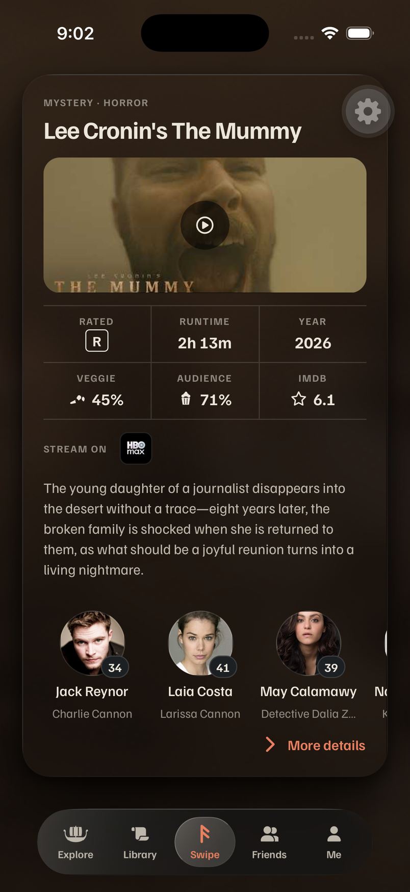
A3"More details" breaks the See rule, with the only leading chevron in the app
MediumiOSWebAndroid
ui-patterns says anything that opens more is See ("See details" is its own example, and the family card uses it). The card back says More details, with its chevron before the words. design.md names it More details, so the two docs disagree.
Where
CardBack.tsx:201–204, HowToFaces.tsx:120 vs FamilyMemberSheet.tsx:63; design.md § The back of a swipe card
Right today
ui-patterns § Words on actions.
Direction
Ask the owner once ("See details" or keep "More details" as the named exception), then fix the loser doc; chevron after the words.
The card back: More details, chevron first.
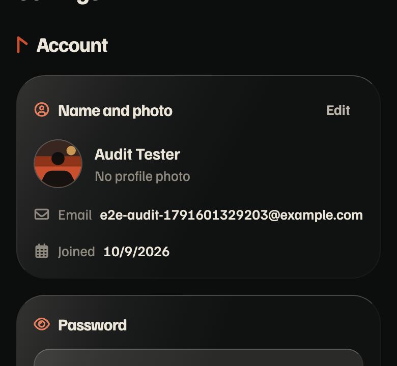
A4Settings opens editors two ways and writes the date like a spreadsheet
MediumiOSWebAndroid
Name and photo and Streaming services open their editors from "Edit" in the card header; Password opens its editor from a full-width "Change password" button. Account says "Joined 10/9/2026" while the rest of the app writes "Oct 22, 2021".
Where
Settings.tsx:167, MyServicesCard.tsx:30 vs Settings.tsx:98; Settings.tsx:192 (toLocaleDateString())
Right today
design.md: "Edit" (ghost, small) in the card's header; formatDate.
Direction
Password gets "Edit" in its header like its neighbors; Joined uses formatDate.
Web, 390.
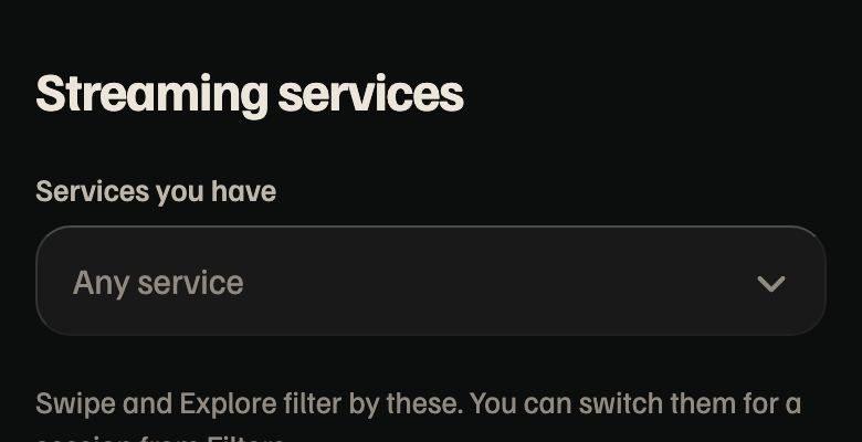
A5Streaming services are picked three ways
MediumiOSWebAndroid
Onboarding: a grid of logo chips with a search field. Settings: a dropdown field that opens a second sheet, on a page that has nothing else on it. Filters: the inline checklist. The filter rules already say services are "a checklist right in the editor, never a field that opens a second sheet".
Where
ServicesStep.tsx:151, 227 (ServiceChip), ServicesSelect.tsx:44 via MyServicesCard.tsx:124, BuilderSheet.tsx:487
Right today
The filters' inline MultiSelect.
Direction
Settings → Streaming services shows the inline checklist (ServicesSelect inline); onboarding's chip becomes Chip with a logo.
Settings → Streaming services: a dropdown.
A6Android's glass may be a tint only
MediumAndroid
Glass asks expo-blur for Android's real blur through experimentalBlurMethod, which this SDK has renamed: Metro logs "The experimentalBlurMethod prop has been deprecated. Please use the blurMethod prop instead" on every glass view. If the old name is ignored, every surface on Android is a flat tint. Unverified: no emulator was run.
Where
Glass.tsx:65
Right today
expo-blur's current blurMethod.
Direction
Rename to blurMethod and check one Android screen.
A7Grids load with a spinner where the rule says shimmer; navigation outside openRoute
LowiOSWebAndroid
Library and Explore show the carving rune while their posters load; ui-patterns says a picture loading is a Shimmer in its own shape. Button's loading state uses the system spinner, the only place it appears. Library's "Go to Swipe" calls router.navigate, and two profile screens call router.replace; lint bans only push and back.
PosterGrid draws a page of poster shimmers; goToTab("swipe"); lint router.navigate and router.replace outside lib/navigation.
2 · Every interaction, by area
What each area lets you do, whether it behaves like Swipe and Library (haptics from @/lib/haptics, motion from @/lib/motion, a tab re-tap that goes to the top, pull to refresh where there's a list), the feedback it gives, and anything dead or surprising. "Verified" means seen on the simulator; the rest is from the code.
Area
What you can do
Like Swipe and Library?
Feedback
Dead or surprising
Swipe
Throw a card three ways with stamps, tap to turn it, Undo, the card's ⋯ folds Filters and Sort, keys on web, VoiceOver actions
Reference
carve(1) a swipe, carve(2) watchlist, the glow follows the drag, the Library tab pulses
Nothing dead found. The bar to match.
Library
Shelves (segmented, sliding lens), search bar, Filters and Sort, Restore on Passed, pull to refresh, tab re-tap to top
Reference
The bars hide while scrolling; the lens slides
Switching shelves gives no haptic, while the tab bar (same lens) ticks. Restore has no haptic. No long press on a poster (PR #378 is open).
Explore
Search bar, Filters with count, Sort, FilterNotice, grid, tab re-tap
Mostly
Still at rest, by the owner's call
No pull to refresh (Library has it; PosterGrid supports it). No long press.
Spotlight
Field docked on the keyboard, round × beside it, recents, Top Hits, rows
Mostly
Pull down closes; no haptic on open or pick
Native glass for it is only on PR #433's branch, not in ios/review.
Title page
Seen and Watchlist toggles, score strip opens Scores, See all sheets, scrub the stave rail, Share, trailer
No
The rail ticks; Share ticks
Watchlist and Mark watched change color and nothing else (verified): no haptic, no Library pulse, no motion. The rail's label floats over the cards. No pull to refresh, no long press on cast or rails.
Season
Check an episode, Mark season watched, "Also mark E3–E4?"
Yes
carve(1) a check, Dagaz and carve(3) at a season's end
The best feedback outside Swipe; the title page should borrow it.
Person
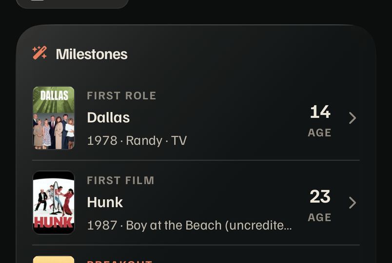
Biography See all in place, Milestones rows, Family → tree, Awards See all, Share
Partly
Rows dim (quiet), they don't brighten
Back and Share sit on the biography once scrolled (verified).
Film lineage
Pan and pinch, + and −, tap a portrait for the family card, See their family recenters
Yes
Moves on the UI thread with CHISEL; no haptic on recenter
Draws for Brad Pitt (verified, iOS and web). At 390 the first view cuts relatives at both edges with no fade to say there's more.
Studio, place, awards
Movies / Shows and Filmed here / Set here segments, category tiles, year sheet, Explore all winners
Partly
Tiles give a little; segments slide
No haptic on a segment change. No Share on studios, places or ceremonies.
A first-view stagger and the theme wash; the motif carves
Tapping Me again does nothing when scrolled (verified; Library, Explore and Friends go to the top). No pull to refresh. Buttons sit on content when scrolled.
Someone's profile
Follow (tap again to Unfollow), Share, ⋯ → Report or Block in the sheet, counts → Connections
Partly
Follow morphs with cut, carve(2) when you become friends; the ⋯ steps tick; Block carves
Follow is the best social interaction in the app. Share opens a custom sheet where titles open the system sheet.
Connections
Friends / Followers / Following segments, Follow and ⋯ per row, requests, pull to refresh
Partly
Follow as above
No haptic on the segment change; square ⋯ per row.
Friends
Search bar (Find people), suggestions you can hide, pull to refresh, tab re-tap
Yes
A hidden suggestion swipes away with cut
Empty: two actions with two names for the same search.
Inbox
Swipe a row left to dismiss, Accept and Decline, × on web with a mouse
Yes
The Dismiss stamp carves in with cut, the row folds; Accept carves
Titled Inbox, empty state says notifications.
Settings
Toggles that save as you change them, Edit → editors, Change password, Blocked accounts, Beta
Partly
"Saved" with a tick (useSavedNote)
Two ways into an editor.
Editors
Edit profile, password, services, lists, pickers: Cancel and Save pinned
Partly
Save goes back; no haptic on a save
Save and Cancel on a solid bar above the tab bar (round 1, row 4).
Sheets
Slide up, pull down anywhere, tap outside; Android back closes (Modal onRequestClose)
Yes
DURATION.slow with CHISEL
Four endings (P8).
Onboarding, sign-in, Welcome back
Question cards are real Swipe cards; poster wall; Apple and Google first
Yes
Deal, carve, wall drift with Reduce Motion respected
Not rechecked this round (the smoke account can't be signed out).
3 · Duplicated components
Each job, the component that should own it, and every copy. Counts are call sites on ios/review outside the primitive itself. jscpd finds only 0.37% copied lines, so these are copies by shape, not by text: they pass pnpm check:dupes.
SharePageButton (titles, system sheet) and shareProfile + ShareProfileSheet (profiles, QR sheet); ShareProfileButton.tsx is a one-use wrapper; COPIED_MS and the copied-timer effect are written twice (ShareProfileSheet.tsx:16, 44, SharePageButton.tsx:7, 26)
Report's radio rows (ProfileActionsSheet.tsx:255), the only radio icons in the app
1
Loading
Spinner (the carving rune), Shimmer for pictures
System ActivityIndicator: Button.tsx:128, AppleSignInButton.tsx:30, GoogleSignInButton.tsx:29
Spinner 24 · Shimmer 6 · system 3
Ending a sheet
none written
Cancel, Done (ghost), Done (primary), Apply (P8)
4 patterns
4 · Per-platform scorecard
Grades are against design.md's "iOS first, every platform good": each platform gets its own best version (native glass on iOS 26, drawn glass and hover states on web, Material touch feedback on Android), not iOS's leftovers.
iPhone B
Verified on the simulator
Glass
Drawn everywhere; native only on PR #433's branch
B−
Motion
Swipe, the turn, the stagger, carves, Follow's morph
A−
Haptics
Swipe, Follow, Inbox, seasons; none on Library, segments, title toggles
C+
Gestures
Throw, pinch, pull to dismiss, swipe rows; no long press anywhere
B
Chrome
No top scroll edge; buttons on text
C
Consistency
Strong on Swipe, Library, Explore; weak in people
C+
Web B−
Verified at 390 and 1280
Glass
Drawn glass with backdrop-filter; reads well
B+
Hover
No hover state anywhere (0 hover: classes)
D
Keyboard
Swipe keys, Spotlight's shortcut, Esc on takeovers and sheets
B+
Desktop layout
Profile in two columns, Settings at form width
B
Share
Copies the link where there's no Web Share, with a check
A−
Rows
Inbox gets a × with a mouse; other rows have no hover
C+
Android C
From the code only: unverified
Glass
Real blur through a renamed prop; may be a tint (A6)
C
Touch feedback
iOS's dim and shrink; no ripple
C−
Back
Takeovers, sheets and Found it close on back
A−
Haptics
Same calls as iOS through @/lib/haptics
B
Keyboard
Sign-in and onboarding avoid it only on iOS; Android relies on resize
C+
Share
The link rides inside the message, as Android needs
B+
What web and Android get for each recommendation
Recommendation
iPhone
Web
Android
Glass 1 · Back and round buttons (A)
Native GlassView, interactive
Drawn glass as today, plus a hover brighten
Drawn glass; a ripple on press
Glass 2 · The floating logo (A)
Native capsule that materializes
Drawn glass capsule, fading as today
Drawn glass capsule
Glass 3 · Me's grouped buttons (C)
One GlassContainer capsule
One drawn capsule, each half hovers
One drawn capsule, ripples per half
Glass 4 · Floating Save and Cancel (A)
Native buttons, no bar
Drawn buttons, no bar; Enter saves
Drawn buttons, no bar, above the keyboard
Glass 5 · Panels over the wall (C)
Tinted native glass
Drawn elevated glass
Drawn elevated glass (needs A6 to blur)
Glass 6 · Sheets (C, later)
Tinted native glass
Drawn elevated glass
Drawn elevated glass
Top 10 · 1 One Share
Round top button, system sheet or the QR sheet
Same button; copies the link without Web Share
Same button; system share
Top 10 · 3 Scroll edge
A fade under the status bar and buttons (iOS 26's own effect where native)
The same fade, drawn
The same fade, drawn
Top 10 · 4 Saving feels like Swipe
carve(2), Library pulse, the check carves
Library pulse and the check (no haptics on web)
Same haptics as iOS, pulse
Top 10 · 5 Segments tick, Me re-tap
tick() on change; re-tap scrolls to top
Re-tap scrolls to top
tick(); re-tap scrolls to top
Top 10 · 6 One row
Brightens on press
Brightens on hover and press
Ripple
Press feedback in general
Today's dim and shrink
Add hover: to Tap's four feedbacks
Add android_ripple inside Tap and Button
5 · Protect, fix, and the round 2 top 10
Consistent: protect
Anything in the deck is a SwipeCard: titles, the how-to, questions, onboarding's three.
FilterBar is the same on Explore, Library and Swipe, search leading on two.
One search field, held by lint.
The tab bar and its journey on every screen.
Follow's morph and its carve.
Inbox's swipe to dismiss (DismissableRow), with a × for a mouse.
Season checks: carve(1) and the Dagaz.
Sheet: 20 uses, pull anywhere, Android back.
Brand fallbacks: poster art and people art everywhere (トリック's row in Connections).
SpecStrip, the same on the card back and the title page.
EmptyState (30 uses) and Page.Group headings.
Saved as you change it (useSavedNote).
Inconsistent: ranked
A1 Core verbs change by screen
P1 Share: five buttons, four names
P3 Chrome on text, no scroll edge
P2 Square icon buttons in people
P7 Hand rows, wrong press
P4 Three people strips
P8 Four sheet endings
A5 Services three ways
A6 Android glass prop
P6 Card icons
P5 See all in two places
P9 Two names per action
A2 Release twice, two streaming vocabularies
A3 More details vs See details
A4 Settings editors and the date
P10 Empty-state buttons
P11 Hand banners, pills, bars
P12 Signed-out layout
A7 Grid loaders, navigation calls
Round 2 top 10, as shippable PRs
PR 1 · Saving a title feels like Swipe
The two biggest gaps against the owner's reference screens. Small: InteractionButtons, SwipeCard's labels, SegmentedControl, me.tsx.
Seen and Watchlist everywhere (A1): title-page buttons read Seen and Watchlist, on with a check, in the swipe colors.
The title page's toggles give Swipe's feedback: carve(2) for Watchlist, carve(1) for Seen, pulseTab("library"), the check carves in.
No dead taps: tick() on every segment change (Library's shelves first), and tapping Me again scrolls it to the top.
iOSWebAndroidOver the air
PR 2 · Profile header
Fixes the people area's two loudest problems; pairs with round 1's rows 1 and 3.
One Share (P1): the round top-right button on every page with a public link, profiles and studios and places too; header rows keep only Edit profile or Follow, and ⋯.
Icon buttons are round (P2): default in Button; the eight square call sites follow.
iOSWebAndroid
PR 3 · Scroll edge
One change in Page; every pushed screen benefits.
A top scroll-edge fade (P3) under the status bar and round buttons, and the rail's label kept clear of cards.
iOSWebAndroid
PR 4 · One row, one people rail
The biggest duplicate cleanup; deletes code.
ListRow for every row that opens something (P7): a leading poster, a trailing value, one chevron, the row press; lint the hand chevron.
Profile cards (P4, P5, P6): one people rail at CastMember's size, an icon on every titled card, answers' See all in the header.
iOSWebAndroid
PR 5 · Words and endings
Copy and small rules; low risk.
Copy sweep (P9, A2, A3, A4): Find people; "Nothing in your inbox yet"; anymore; Stream on and Rent or buy; release once; the date through formatDate; Password's Edit; ask once about More details.
Sheet endings and empty states (P8, P10): choice sheets end with no button, task sheets with their action; EmptyState draws one primary and an optional ghost.
iOSWebAndroid
Next after these: Settings' services as the inline checklist (A5), blurMethod for Android (A6, with one emulator check), hover on web and ripple on Android inside Tap and Button, and round 1's glass chrome.
Missing rules for ui-patterns.md
Rule to add
Says
Fixes
Share
The round top-right button on any page with a public link; always "Share"
P1
Icon buttons
Round, always
P2
Scroll edge
Content under the top chrome fades; nothing sits on text
P3
Saving a title
Seen, Watchlist, Pass on every surface, with Swipe's haptic and the Library pulse
A1
Rows
Any row that opens something is ListRow (people: UserRow; filters: FilterRow)
P7
People in a row
One rail at CastMember's size
P4
Disclosures
See all / See less go in the header, like See all
P5
Card titles
A titled card has an icon
P6
Ending a sheet
Choices: no button. A task: its one action. Never Cancel and Done together
P8
Empty states
One primary action, an optional ghost second
P10
Tab roots
Every tab root scrolls to top on a re-tap; every list pulls to refresh
Me, Explore
Segments
A segment change ticks, like the tab bar
Library, Connections, awards
Dates
formatDate, never toLocaleDateString()
A4
Per platform
Web: every Tap and Button has a hover. Android: a ripple
Section 4
Film lineage, rechecked
Brad Pitt's tree draws on iPhone and web
Not a bugiOSWeb
Opened by deep link and through Person → Family on the simulator (ios/review a49e03ed), and on web at 390 and 1280: the tree draws with Douglas Pitt, Angelina Jolie, Gwyneth Paltrow and the children. Staging's family graph for Q35332 has 180 people and 265 links; his own lineage is first generation with family, so the person page shows the Family card ("See Brad's family tree"). Round 1's empty frame came from ios/search-style 8bce35a7 and didn't come back.
One small thing: at phone width the first view cuts relatives off at both edges (FIT_MIN 0.75, FamilyTree.tsx:19) with nothing to say there's more to pan to.
iOS, 9:55 PM, after Person → Family.
Saga · Prototype · Round 1 · October 9, 2026 · Apple sprint (#373) · follows #423 and PR #433
Liquid Glass across the app
Round 1. Explore, Library and Swipe already feel right; the rest of the app doesn't. The owner picked iOS 26's native glass for Spotlight and the bottom bar (#423 round 3, PR #433) and asked where else it belongs: "Pick native glass when possible, as it's the most cohesive." Below: what every other screen is made of today, then each place where native glass could go, ranked, with the options side by side over a piece of the real screen.
How to read a row.A is native glass (GlassView), B is today, C is a variant (tinted glass, glass grouped in a GlassContainer, or less glass). The red box is my pick. Every piece is drawn at iPhone 17 size (402 pt wide) over a crop of the simulator screenshot, shown at 95%.
Status at round 2. Nothing here is picked or built yet. The native glass from PR #433 lives only on its branch (ios/search-style, still open); ios/review and master have no GlassView. docs/conventions.md § Liquid Glass still says not to use expo-glass-effect. Round 2's PR 3 (scroll edge) and PR 2 (round Share) sit next to rows 1 and 3 below.
Today on iPhone
Branch ios/search-style (8bce35a7, PR #433 before its native glass), iOS 26.5 simulator, staging, the smoke account. Every surface below is one of three things:
Drawn glass the Glass primitive (a blur, a dark tint, edges lit on two sides, a sheen),
Flat a translucent fill with no blur (buttons, chips, the floating logo),
Plain nothing behind it. Nothing outside the bottom bar is native glass yet. The gear at the top right of every screenshot is the dev build's Tools button; the phone doesn't have it.
Title pages
People, places, studios, awards
You, Settings and Friends
Sheets, Swipe and the panels over the wall
Not captured on the phone: onboarding and sign-in need a signed-out or reset account, and resetting the shared smoke account would wipe it. Sign-in is the web build at 402 px (the same HeroPanel as Welcome back); onboarding is OnboardingShell's flat fills plus the drawn-glass ChoiceCard.
Saga has no toasts. Confirmations are inline (the button changes, a row appears). If one is ever added, it's a native glass capsule like the beaker tab.
Film lineage drew no tree on staging for Brad Pitt (only the + and − buttons). Rechecked in round 2: it draws on today's build (see above).
The ranked list
Ranked by how much more of one piece the app feels, against risk. Every row ships over the air: expo-glass-effect 57.0.4 is in build 3 and build 4, and PR #433 proved GlassView draws when styled with a plain style. Each one falls back to today's drawn Glass on web, Android and iPhones before iOS 26.
The rules this follows
Native glass is chrome, not content. It goes on the things that float over the story (buttons, the logo, panels and sheets over imagery), never on the story itself (cards, rows, posters, long text).
Siblings, never nested. Glass can't sample glass: a field inside the overlay's glass almost vanished in round 3. Anything that sits on native glass becomes a flat fill (the search circle in Welcome back's panel, a segmented control in a sheet).
One primitive owns it. A NativeGlass inside Glass (or a Glass.ios.tsx), switched on isLiquidGlassAvailable(), styled with plain style, not uniwind className. Screens never test the platform (docs/conventions.md).
Appearing: native glass ignores a fading parent. Use glassEffectStyle={{ style: "regular", animate: true }} from "none" for the logo capsule and sheets, iOS's own materialize, instead of an opacity.
Reduce Transparency keeps today's solid granite on every row.
Docs to update with the first PR: docs/conventions.md § Liquid Glass and brand-identity.md § 6 still say not to use expo-glass-effect (#332).
My recommendation
Ship rows 1 to 5 as one "glass chrome" update, right after PR #433. They're the floating pieces you see on every pushed screen and the two big moments: Back and the round buttons (A), the floating logo (A), Me's What's new and Settings as one grouped capsule (C), editors' Save and Cancel floating with no bar (A), and the panels over the poster wall in tinted native glass (C). Together they make the top of every screen the same material as the bottom bar the owner just picked, they're all fixed chrome rather than scrolling content, and most of it is two primitives (RoundButton and Glass's HeroPanel) plus ScrollLogo and PageFooter. Row 4 also fixes a brand rule today breaks: "content goes under the chrome, never behind a solid bar".
Then sheets (row 6), as their own update. They're the biggest remaining surface and should match Spotlight's native overlay, but they're full of text and of controls that would become glass on glass, so they need a flat-in-sheet variant of SegmentedControl and a measured open time (docs/performance.md) first. Rows 7 to 9 follow whenever there's room.
Don't put glass on cards, Settings groups, list rows, the swipe card's buttons or long text. Over Saga's flat basalt, native glass has nothing to refract, so it turns into a gray slab with a rim; dozens of them on a scrolling page cost frames; and the card buttons are printed on the poster by the owner's own call. If anything, cards could lose their blur later (they blur a flat background today), but that's a performance question, not this one.