iOS-style search
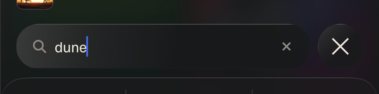
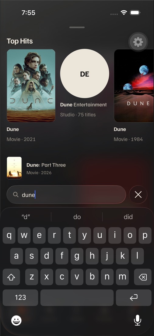
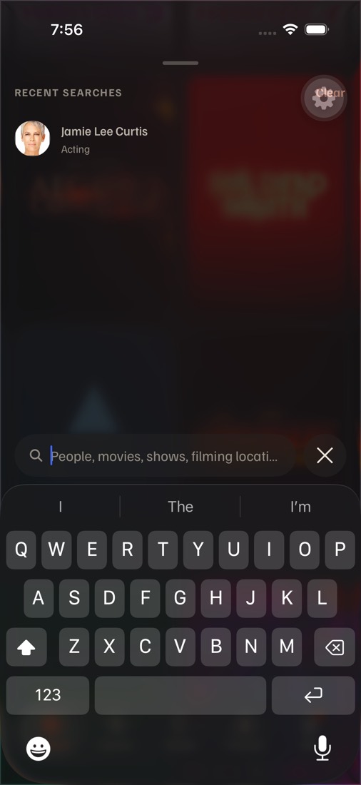
ios/search-style, 87357c74, iOS 26.5 simulator, staging). Three materials, A · B · C, for three decisions: the overlay, the field and its ×, and the bar's field over posters. Every field says "Search".Today on iPhone
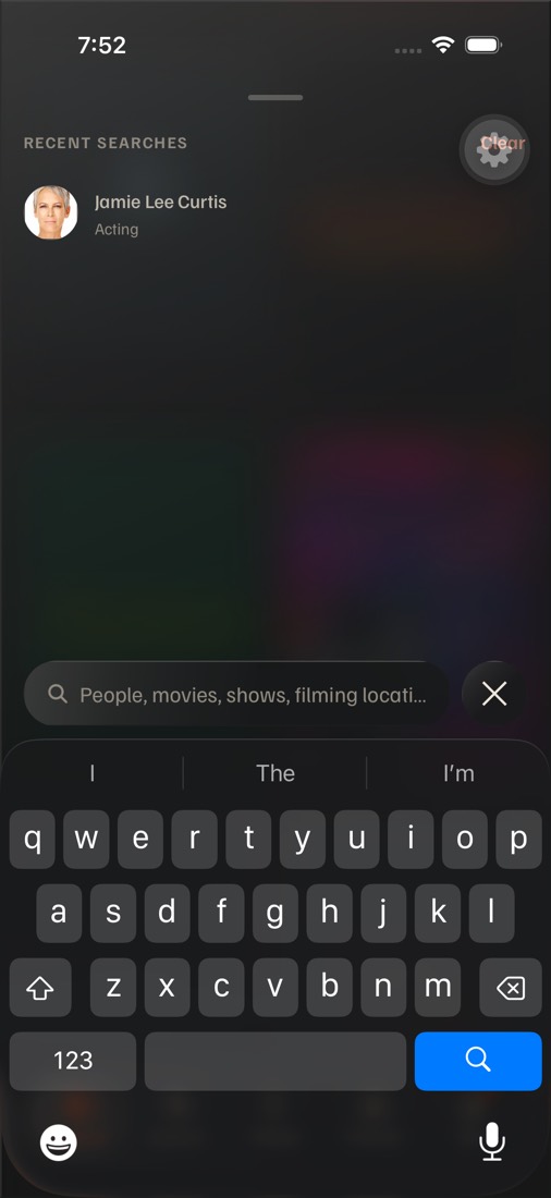
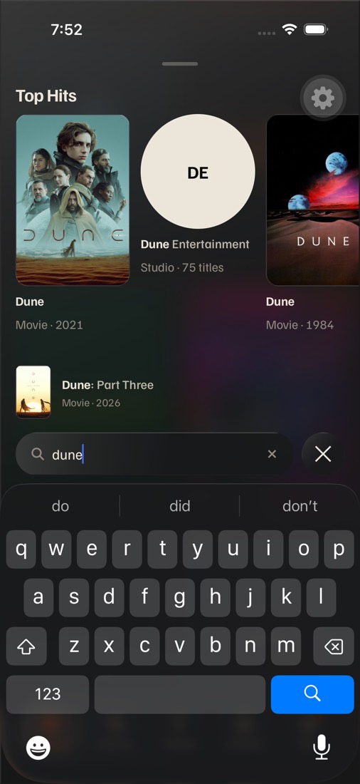
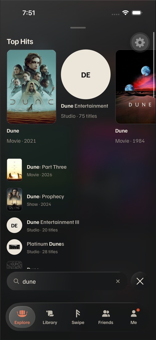
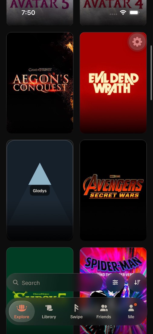
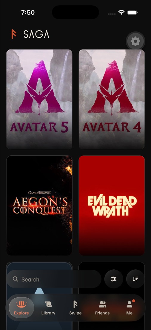
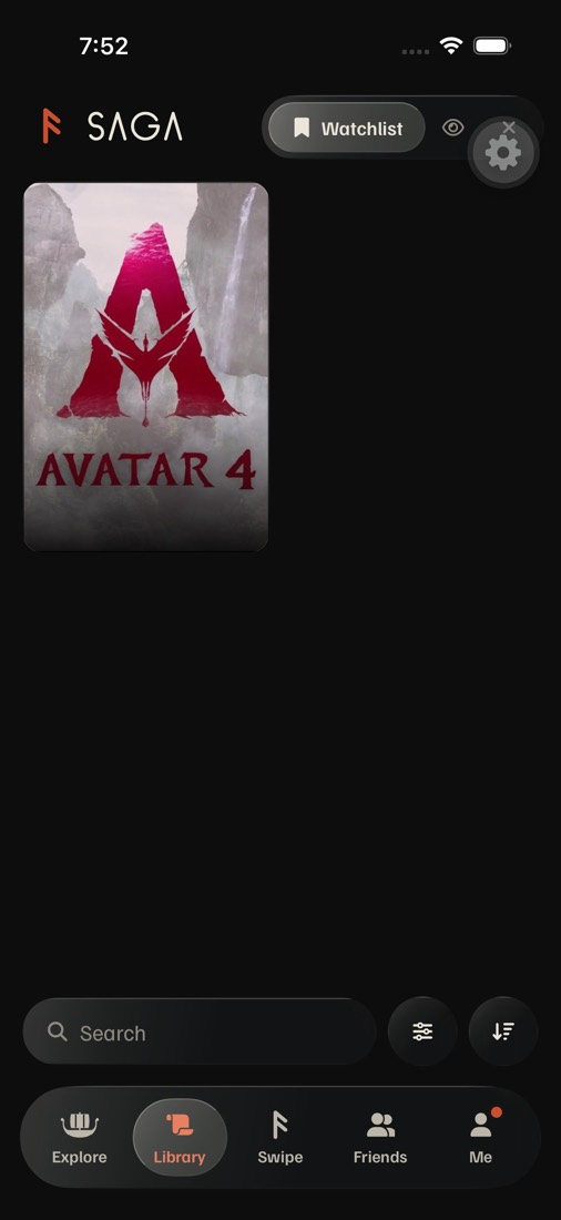
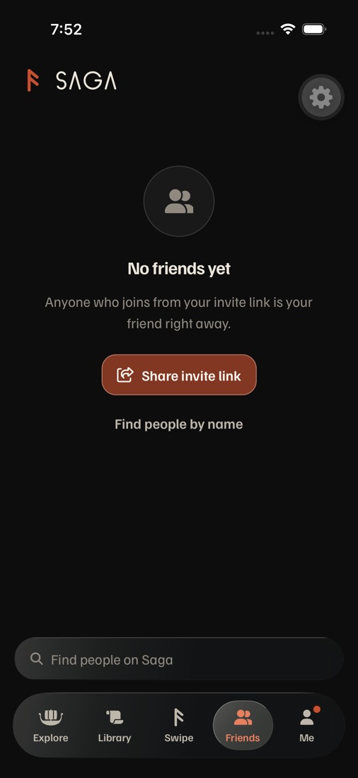
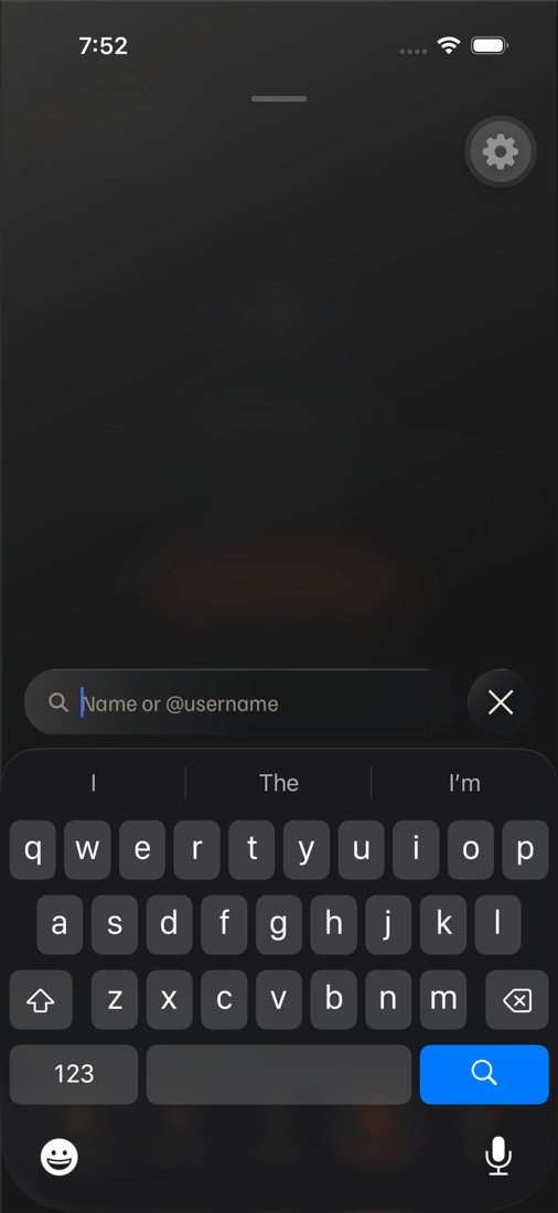
Screenshots from the app the owner tested (PR #433). The gear at the top right is the dev build's Tools button; the phone doesn't have it.
Why it reads muddy
The overlay is two darks stacked, the field is the same recipe as the overlay under it, and the edges are drawn on one side only. Colors below were sampled from the screenshots.
| Layer | What it is today | What you see |
|---|---|---|
| Spotlight's overlay | Takeover → Glass variant="elevated": expo-blur at intensity 80 with tint "dark" (Apple's dark blur, already a dark material), then glass-tint-heavy rgba(16,18,19,0.74) on top, then the sheen (bone 14% → 5% → 0). No separate dim layer: the 74% wash is the dim. | About a quarter of the screen behind gets through, as blurry color clouds. Sampled #222022. It reads as fog, not glass: nothing behind has a shape, and the overlay has no edge. |
| The field | SearchInput elevated → the same Glass elevated recipe (blur 80 dark + 74% tint), blurring the overlay that's already dark. | Sampled #18191a, a little darker than the overlay around it: a contrast of 1.1 : 1. The keyboard just below is #1a1a1c, so the field, the overlay and the keyboard blend. |
| Edges and shadow | border-t rgba(255,250,240,0.22), border-l 0.12, border-b and border-r 0.04. No shadow. | The capsule has a top edge and nothing under it. With the keyboard up, its lower half dissolves into the keyboard; on the tab bar, into the tab bar. |
| The round × | The same elevated Glass, 48 pt. | Only the white × reads; the circle is another patch of the same dark. |
| Words | Placeholder "People, movies, shows, filming locations" in fg-muted #8f897f. | Long and dim. Every option says "Search". |
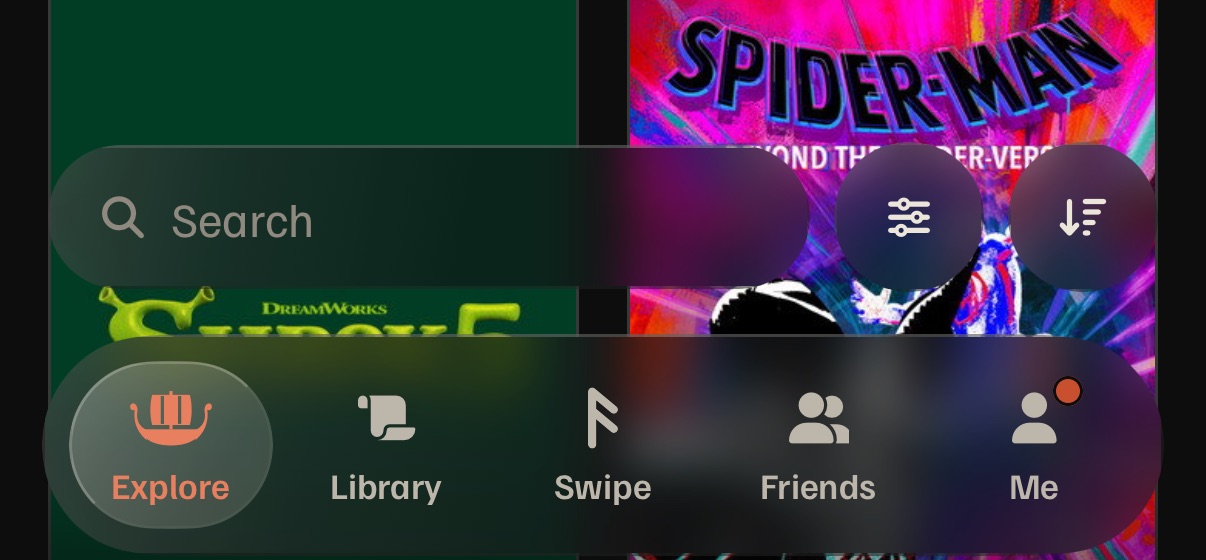
| Explore's and Library's bar | SearchButton → Glass default: blur 40 "dark" + glass-tint rgba(16,18,19,0.55) + sheen. Filters and Sort are the same glass. | A light blur keeps the poster's hue while the dark wash takes its brightness. Over Shrek 5's green #013d25 the field is #0b251c; over Spider-Man's pink the Filters and Sort circles are #4d224f and #402d4d. Murky green and plum: the muddy look. |
What build 3 can already do: Liquid Glass
Every option here ships over the air: none needs a new native build. expo-glass-effect (iOS 26's native GlassView: styles regular and clear, tintColor, colorScheme, isInteractive, and GlassContainer to merge neighbors) has been in package.json since the first commit, so it's autolinked into build 3. The app stopped using it in #332 because it "drew nothing". This round tried it again with a throwaway local edit on the simulator (reverted, never committed):
regular, dark, 35% tint). Explore shows through: Evil Dead Wrath's red, Aegon's Conquest.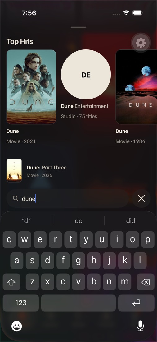
- Why #332 saw nothing isn't proven. Then,
GlassViewwas styled through a UniwindclassName; this test used a plainstyleand it drew. Either way, A ships only after it draws on the owner's phone. - iOS 26 only.
isLiquidGlassAvailable()is false before iOS 26: those phones, web and Android keep drawnGlass, with B's values as the fallback.
1 · Spotlight's overlay
How much of Explore shows through, and how. Each phone uses that option's field too (decision 2), so the screen reads whole. Explore behind is set to bright posters, the hard case.
2 · The field and the round × on the overlay
At 1:1, the docked row over a piece of Explore. Each option is shown on A's clear overlay (the recommendation), while typing, and on the other two overlays, so any field can go with any overlay.
3 · The bar's field on Explore, Library and Friends
The field with Filters and Sort, over busy posters. The tab bar stays as it is in every option. Tapping the field opens Spotlight with its field in the same material, so the field seems to lift onto the keyboard.
Cost at a glance
| Option | Native build? | Blur views on Spotlight (today: 3) | Blur views on Explore's bar (today: 3) | Risk |
|---|---|---|---|---|
| A · Liquid Glass | Over the air iOS 26 only uses the native module already in build 3 | 3 native glass views (overlay, field, ×), the row beside the overlay's glass | 3 native glass views | #332's history; legibility over the brightest posters; re-measure Spotlight's open (≤ 5 frames over today) |
| B · Frost | Over the air | 1 (the overlay); field and × become fills | 3 drawn blurs, as today | Low: a material and a fill in Glass |
| C · Solid | Over the air | 0 | 0 | Low technically; departs from the glass brand |
The frame budget (docs/performance.md) is 8.3 ms a frame at 120 Hz. Spotlight's long first frame today is the full-screen live blur mounting while the keyboard rises. Fewer blur views is cheaper on older iPhones (iOS 26 runs back to the iPhone 11); native glass is drawn by the system, the same kind of view as today's blur, so its cost has to be measured on a phone, not guessed. The simulator can't show 120 Hz.
My recommendation
A, Liquid Glass, for all three: the overlay, the field and ×, and the bar. It's exactly what the owner said is missing: the overlay looks like glass because Explore is visible through it, and the field stops muddling in because it's lighter than the overlay and has a rim all round, the way iOS 26's own search does. The simulator test shows it draws in build 3, so it ships over the air. Use one material everywhere a search field appears, so tapping Explore's bar reads as the same field lifting onto the keyboard.
Build it behind an Options switch against B (useOption), so the owner compares both on the phone in one update. B is the safe path: the same layout, a frosted overlay and a bone-filled field, with no native view involved. It's also A's fallback on phones older than iOS 26, on web and on Android. If A's overlay is hard to read over the brightest posters on the phone, use B's overlay with A's field and bar (decision 2 shows A's field on B's frost).
Not C. It's the clearest and the cheapest, and it removes Spotlight's slow first frame, but it's the opposite of "glassy". Keep it in mind as the Reduce Transparency look, which is already close to it. Two follow-ups with A: the tab bar and the round Filters and Sort buttons should move to the same native glass in the same change, so the bottom of the screen is one material; and docs/conventions.md and brand-identity.md § Material need updating, since they say not to use expo-glass-effect.
Round 2: where the close goes, and the bar picked 1B + 2A, shipped in PR #433
Round 2 · Today on iPhone (master 4242d340)
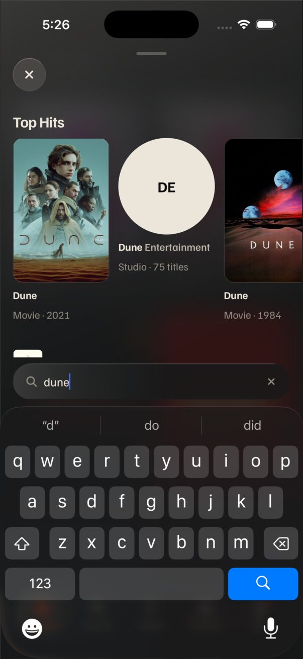
The field is already where iOS puts it: full width, 16 pt from each edge, 8 pt above the keyboard. The one thing out of place is the × that closes Spotlight: a 44 pt glass circle at the top left, under the grabber, about 400 pt from the field you're typing in. On Explore and Library, search is the first of three 44 pt glass circles, Search · Filters · Sort, packed to the right just above the tab bar.
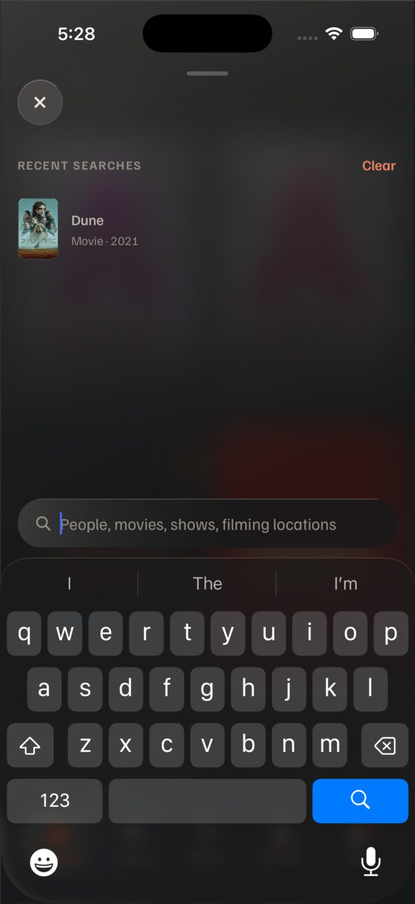
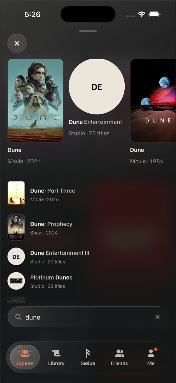
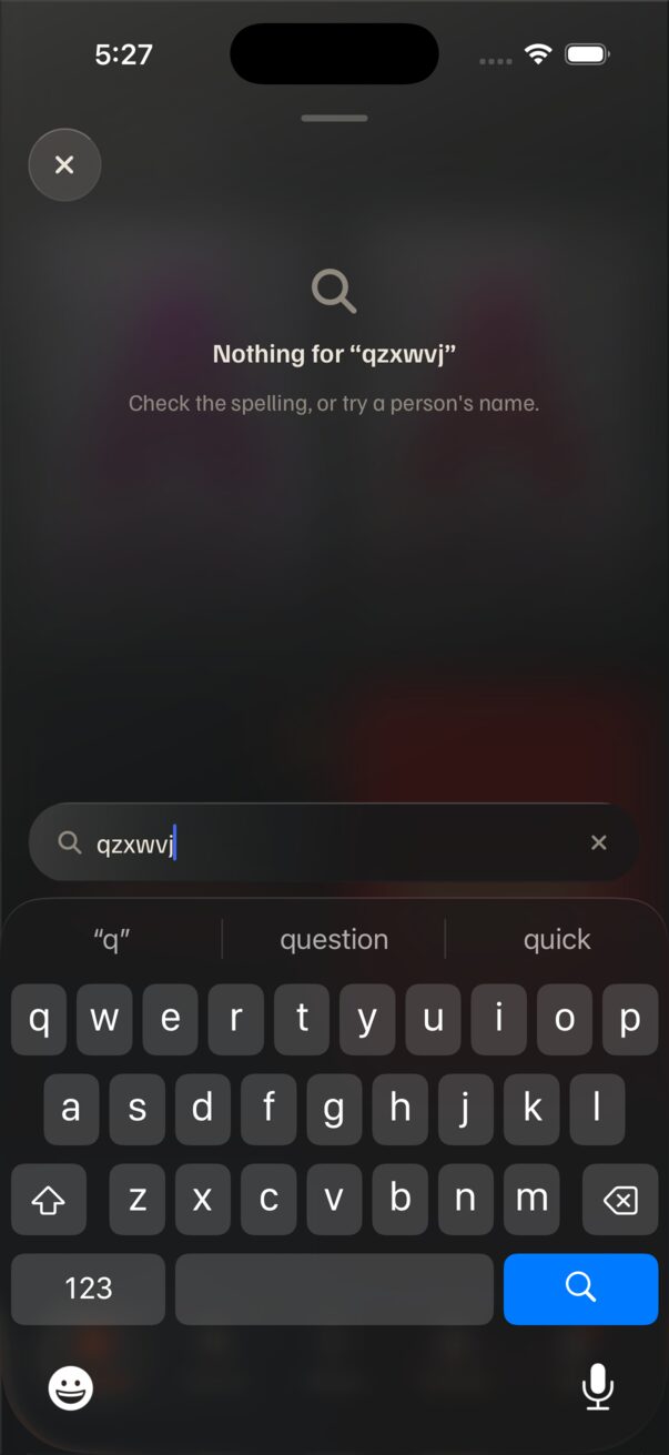
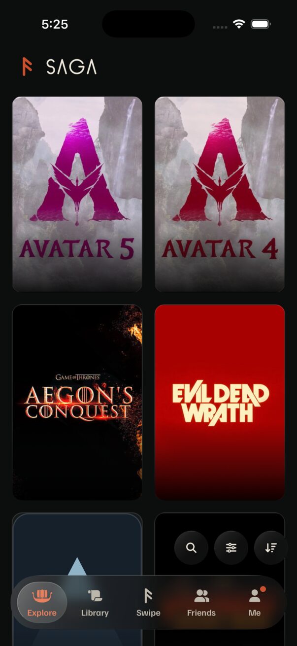
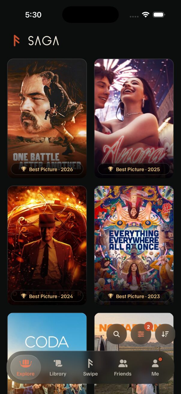
- Spotlight's ×: 44 pt, 17 pt from the left, 77 pt from the top. It belongs to
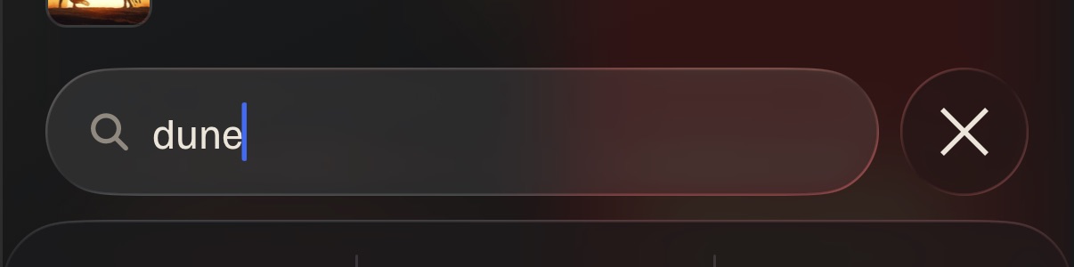
Takeover; the grabber and a pull down also close. - Spotlight's field: 46 pt tall, 368 pt wide, its own clear × inside on the right once you type. Keyboard up: 8 pt above the keyboard. Keyboard down: 34 pt above the tab bar (
field-placement.ios.ts). - Explore and Library: three 44 pt circles, 8 pt apart, right edge 13 pt in, bottom 14 pt above the tab bar (
FilterBarwith a searchBarIconButton). The search target is 44 × 44 pt.
1 · Spotlight: the close moves beside the field
iPhone only. The field stays where it is, and whatever closes Spotlight sits on the field's row, so the × at the top left goes away (the grabber and pull down still close). Web and Android keep their field at the top and don't change.
2 · Explore and Library: search across the bar
The bar stays above the tab bar, in thumb reach. Search becomes a field as wide as the bar allows; tapping it opens Spotlight, whose field is right there above the keyboard. Every state below uses round 2's recommended close (1B). Placeholder: "Search" (the full "People, movies, shows, filming locations" doesn't fit beside two buttons; Spotlight keeps it).
My recommendation
Spotlight: B, the glass × beside the field. It is exactly the ask ("x moves down directly right of the search bar"), it is what iOS 26 does in its own search tabs, and it is the same glass circle the × already is, just moved 400 pt down to where your thumb is. One tap closes, typed or not. A's Cancel is the iOS 18 look and reads as loose text on glass. C saves the room but makes one × mean two things, so leaving after typing takes two taps.
Explore and Library: A, the field with Filters and Sort to its right. Also the ask word for word. The search target grows from 44 × 44 pt to 262 × 46 pt, Filters and Sort stay one tap each, as approved on 2026-10-08, and the bar's circles match Spotlight's ×, so opening search reads as the field lifting onto the keyboard. B costs Sort a tap and reworks the Filters sheet. C puts two targets inside the thing you tap to search, so a near miss opens Spotlight. Swipe's bar doesn't change in any option.